| back to Gaut Fonts | |
|
|
J.A: He's big, he's Canadian, he's made over a hundred eye-catching display fonts, and until now Dan Gauthier has remained largely unknown to the font-loving public. Dan: I'm not really a shy person but I am very modest, unassuming and down-to-earth. I'm told by my friends and family I don't blow my own horn enough, and that if I don't participate in this interview they'll kill me. J.A: That's kinda difficult to argue with. Dan: I'm not even going to try. To begin with I was born in 1964, in Montreal, Québec, Canada. I now live in Hamilton, Ontario with my wife Kathleen and our daughter Jenna and our four cats. We also have a son named Kevin who's grown-up and out on his own now. I'm a graduate of Mohawk College for Graphic Design, and Sheridan College for Interpretive Illustration. Currently I'm the graphic designer and illustrator for a company called Timber Specialties Co, in Campbellville, Ontario. I also do a little free-lance work for an agency called FPM Marketing in Hamilton—mainly retail & corporate work. All the things I do, including making fonts, have been part of my own personal journey of discovery and self-expression.
Fontmaking is mainly an extracurricular creative outlet for me and I don't make any money with it. I haven't made a new one in a while but I've been busy upgrading many of the faces to full extended character sets. This has proven time-consuming but ultimately will be worth the effort. In spite of my far out fonts, I'm not really a pot smoker, although everyone assumes that I am. Probably because I'm a big guy with a ponytail and my arms are heavily tattooed— J.A: —three marijuana-themed fonts don't necessarily indicate a pot smoker— Dan: —no. The first one, Spliffs, was suggested to me by a ‘chronic’ friend of mine for use in invitations to an annual lost weekend he hosts. Sweet Leaf is my take on a font as described by some dude from Holland looking for a similar lost font on ABF. I followed the thread and discovered this face was searched for in earnest but no one could find it, so I created my own version. Potland is obviously inspired by fonts like Daisyland, Heartland and Calaveras. I also released the base font, called Floraless, if anyone's interested in creating similar faces using that as a starting point. It's all in good fun. J.A: You're not a conventional type designer in the linear abstract sense, but an illustrator-artist drawing expressive fonts. Their strong visceral quality—tension & dynamism—makes them very eye-catching; most fall into overlapping categories of popular & underground culture: comic books, golden era (1940s - 1950s) science fiction and fantasy, pulp magazines, music, classic TV shows & cult horror movies. Dan: I've totally embraced the old adage Do what you know. My fonts are made up of little bits and pieces of my childhood, things I love and admire or things from my environment that have struck me—all sorts of things. There's really no explaining what may fascinate me from one minute to the next, or spark an idea. Some fonts have been suggested to me by friends and family, or may have been a response to some need I've perceived. They're a form of personal expression and self-exploration, and if people also get practical use or enjoyment from them so much the better.
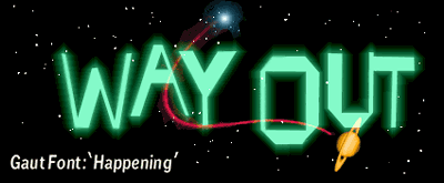
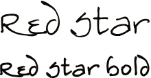
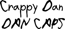
Font-making has proved to be the ultimate marriage of all my creative sides. It's truly design for design's sake. They're also a free creative release from the conservative retail and corporate work I do for a living. For the most part I'm generating letterforms for projects that haven't been conceived yet. Or in the case of pop culture-inspired faces, it's challenging to extrapolate an entire alphabet based on a handful of letters. By their very nature the resulting character sets naturally become art in their own right. I think this can be said of any typeface—I find letterforms in general are quite beautiful. J.A: I'm right there with you on the creative liberty part—my own type designs thrive on philosophical freedom. You're a much more spontaneous artist dealing in substance and manipulation, and very adept at capturing the essence. Dan: I think good design is firstly about achieving objectives, not necessarily imparting myself. I approach each font individually, stay objective and solve my design problems truthfully. My philosophy is to use common sense design principles coupled with my natural artistic instincts. I'm also careful not to over-design—that's a great way to lose your statement. I trust my gut because you just know when things are working and when they're not. I also accept the criticism of others. It might piss me off, but nine times out of ten they'll be right. As far as making fonts goes, I don't think it's that complicated—you apply a set of conditions to the alphabet and the end result is a font. I try to accept what occurs and not overwork letterforms. I get some pretty unexpected glyphs that way. If you tweak things to death you risk losing that initial charming spontaneity. My objective isn't perfection. I purposefully leave little imperfections and flaws for a hands-on look, like a human being was here—the Persian flaw theory. I also try not to forget that fontmaking is supposed to be fun. It's my hobby and that's really why I got into it. Some people are just so very serious about fonts—I say lighten up. Some of my creations are downright ridiculous. Who cares? You win some and you lose some. The really interesting faces can't be made without pushing the envelope a little. J.A: Very true. A lot of font makers are evidently conservative and unwilling to take risks, so it's great to see an artist of your caliber bringing a good dose of spontaneity to the craft. My pick for Handwriting Font of the Moment is Red Star, which we used for the sub-title ‘a conversation with Dan Gauthier’. Is this a case of Get the hang of it & you'll be spanking Ronna Penner before breakfast? Dan: Red Star is based on the handwriting of my good cyberfriend Linda Cappel. She was always a very enthusiastic fan of my work so one day I offered to make a font based on her handwriting because I knew she would get a great kick out of that. She sent me samples and I was floored at how creative her handwriting really is. From what I've seen it's become quite a popular font on the web. J.A: It looks like a bright, positive person directing the pen there, someone with genuine enthusiasm. It may not be your handwriting but it is significant that you chose to font Linda's handwriting and not anybody else's; since Linda has a strong affinity for your work, in that sense Red Star is a reflection of you. Fascinating how that relationship works. You made another handwriting font—Crappy Dan—based on your own handwriting. Dan: Crappy Dan was one of my first fonts. A font based on your own handwriting seems an obvious starting point. Most of the characters came from my handwritten notebooks while I was at Sheridan College. It's probably my most published font as well. And believe it or not, my handwriting has gotten even crappier over the years. J.A: Awe you're not the only one. My cat has neater handwriting than mine. My favorite Gaut Font of all is Happening. This font kills me every time I look at it. It brings back the ultra-weird sense of the fantastic and far-out I experienced as small child alone in bed at night, dreaming of very distant places like Neptune. Dan: Happening is based on a type sample I saw years ago. I don't even remember where I saw it. It simply said ‘Happening’. I guess it made an impression.
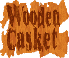
J.A: It certainly fits the 1960's perspective; that extraordinary decade of the space age when our generation were growing up. Happening really captures that sense of excitement—and it's all done with straight lines. Dan: I love letterforms like that from a drawing point-of-view. You go into a sort of automatic drawing mode which I find relaxing. That's also when you get things from yourself you might not be aware were there to begin with. J.A: At the opposite end of the spectrum your painterly fonts are rather groovy too, like Wooden Casket, Organ Donor & Werewolf, and the more liquid ones—Incantation, Phoenix, Bat Font, She Creature. Incantation has a great smashed and splattered effect—something like using a letterpress in the extra-high gravity of Jupiter. Dan: Incantation is one of my attempts to simulate hand-rendered type. I was trying to achieve a random appearance and have the type breath and undulate. I wasn't sure the result was that good initially and attempted to dress it up a little. After a couple of experiments I started adding ‘dirt’. Once again I tried not to spend too much time on it or over-think the process. I generated two character sets with the intent of picking and choosing letterforms from both for the final font. In the end I liked both sets so much and decided to release both 1 & 2, with the idea a designer could mix glyphs from each font to get a spontaneous hand-lettered look. I named them Incantation because I could picture the final typeface inscribed on parchment in a sorcerer's dusty old book of spells.
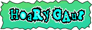
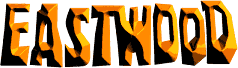
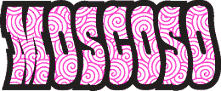
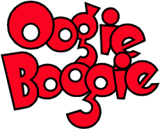
J.A: I'm very keen on Ennio Morricone's spaghetti western films (so-called), a theme you touched on with Eastwood. Dan: I love those films too. Fonts based on pop culture icons serve two purposes: homage to the people who've made an impact on me, and a way of preserving faces that might otherwise become lost, even if only an impression of it. Designers like using these familiar faces too. It's a great way of injecting a flavor into your design because people are already familiar with what they represent. J.A: You're attracted to the artwork of a trio of seminal American poster and comic book artists from the 1960's comprising Rick Griffin, Robert Crumb and Victor Moscoso. Dan: I've always loved those particular artists very much and have been tremendously influenced by them. I probably will make a few more in this mold sometime in the future. I love the nostalgic quality and boldness of Crumb's lettering. Oogie Boogie is another of my faces based on a heading style from one of his strips. I can only imagine what he would think of all this and I hope he would feel honored the way it was intended. J.A: It's helpful to be philosophical about these things; Robert Crumb's handwriting is a wholly original product of himself, yet practically all of the display lettering in his comic book art is based on long-established styles from the early 20th century Robert put his personal stamp on. So if the function of the artist is to renew the tradition to which he belongs, you are certainly doing just that, and doing an excellent job of it. Finally, one Gaut Font that stands out for its very dynamic qualities is Hoary Gaut. Ultra-high impact stuff. What's going on in this one? Dan: Hoary Gaut is another one of my earliest fonts. It started innocently as a quick demonstration for my friend Ali of how to make a font. I made a simple character set and fonted it right in front of him—the end result was pleasing and warranted further development. I've been told it looks like I made it with hammers and sulphuric acid, which I thought was a pretty cool description. I'm really not sure whether I had a true intention here or this is just what came out. Whatever the deal is it's now available with an extended character set. You should wear eye protection when using it.
J.A: Okay, I've got my dark spectacles on. Dan—thanks so much for sharing your thoughts. Dan: It's been a pleasure and I hope font enthusiasts enjoy it. |
|
|
Cosmic Alchemist: A conversation with Dan Gauthier and James Arboghast is copyrighted intellectual property of Daniel Gauthier and James Arboghast (c) 2005, all rights reserved worldwide. The moral right of the authors has been asserted. No part of this document or its contents may be reproduced in any form without prior written permission from the publisher, Sentinel Type™. |