Manfred Klein - the interview
 
1) The early years
2) Günter Gerhard Lange
3) Kleins Fonteria
4) Family and philosophy
 
Manfred @ typOasis
 
How can your family stand living with a typomaniac who does "nothing but things for his own pleasure"?
I have said this often enough myself. I guess they tolerate it. I have never converted my children, not at all. But I carefully pointed out to them in the late eighties the opportunities offered by IT (design, print) and web. Katrin has taken her chance after being an architect and a mother 10 years later.
Now Oliver, who'll soon be 33, in a half-year training with Bates, a leading US agency, inventor of the USP (unique selling proposition), is making his first attempts at advertising and film production. In spite of his computer phobia he is learning to edit films and to do theme-related search of film material. Hopefully he will make his way.
 

Katrin

Olivers Bats
 
Your grandsons Karla and Laurens appear to have some typo-genes?
At first I asked only Karla because she had just started school and she is still inspired by the "license to learn". Playfully I brought her around to painting letters on screen with the mouse. Previously we released the font with her drawings. She did it straight off with enthusiasm - and I could easily do without the special characters.
After you made her font Karlas ABC-start available on the web, Laurens (10) also realized that he could send something like that out to the whole world. This was probably his motive to do as well. He was inspired similarly, although he seems to be a "cool guy" already. I can imagine that design and type is a seed that was planted here in the children's souls. But it's also possible that they will grow in other directions.
 

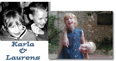
Their father, Claus Dillmann, is a freelance musician and music teacher. There hasn't been too much echo of his art from his children, but Karla intends to learn guitar some day - as did her mother, who met her husband when she was learning to play saxophone too.
 
How do you think about your type-enthusiasm now that you find yourself an esteemed member of the international font community?
Possibly my typographical thinking is more American than German, anyhow, the creative pragmatism of my friends has affected me very much. And an essential motive of my font-mania is therapeutic. Without such work, life would have become unbearable for me a long time ago. If I sit here and write or paint typefaces, everyday life is always shut out, even the headaches and other malaises.
 
Apart from the therapeutic effects of creativity - how is it possible to become a font-addict, as happened with us? Is it the beauty and aesthetics, the variety of 26 letters? Or is it the magic synthesis of spirit and matter? Personally I am fascinated by the expressiveness of a typeface, by the message that it brings itself without a single word of meaningful text being written.

Letters, numbers and symbols are atoms and molecules of our mental life, media to receive and to send messages. For some people who are interested in art they are more important or more interesting than the stuff considered as art by the wider society. Many free artists are aware of it. For the average person, type is a re-discovered cultural asset - nice. To spread reasonable, human thinking in the future not only language is required, but also type. That's pretty clear!
 

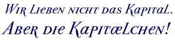
Parma Petit Caps Italic. Quote: Prof. Willberg
(“We don't love capital. But the Caps!”)
 
Do you think there are still some novelties to be expected, such as Sans Serif once was? Or do you belong to the pessimists who see the art of written expression dwindling away - in view of e-mail, Pixelfonts and on-line texts?
The computer, Postscript, the Internet and "globalization" have unleashed a couple of cultural revolutions which also churned the understanding of writing in a mess. A clear lake was transformed into a muddy marsh landscape. All the old rules and values are jeopardized, being replaced with many contradictory new ones. Non-professionals are allowed to make typography - it's the end of knowledge in the hands of a few:  a lot of people who have always been reading, but hardly writing, discover(ed) a cultural asset - design, like with silverware or chairs.
 
Certainly this cultural and typographical mud will be cleaned up again some day, when people will be in need of clear, quick and simple communication. This will also affect the culture of writing. Whatever is going to be developed, in this part of the world it will be based on the old Roman capitals and on Carolus' minuscules. In a hundred years we can get there and have a look.
 
Well, I see our font community having a good time on cloud 9 and instead of playing the harp we are singing font reviews ;-) Thank you kindly for this exciting interview; in fact it's a piece of typographical history!
| PAGE 1 | PAGE 2PAGE 3 | > PAGE 4 | Fonteria |