| Manfred Klein - the interview |

|
| 1) The early years | |
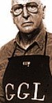
| 2) Günter Gerhard Lange | |
| 3) Kleins Fonteria | |
| 4) Family and philosophy | |
| Manfred @ typOasis |
This article (minus the PS) was published in a special annual edition of the Munich Typographic Society for the 60th anniversary of the master, in 1981.
From Manfred Klein, Frankfurt.
But what’s going on in the typo-scene of 1951? Karl Franke with his followers tries to lead back the remainders of the ‘millennial’ book culture on typographical usability. So the new typography appears mainly in the typographer’s magazine ‘Form und Technik’ which was a leading forum at that time . With a lot of lines set in small caps, with fine oblique lines running from above downwards across the paper, with a few black or colored pica-big square surfaces to the rounding. Everything somehow thin and ethereal - however, it’s the first time such a thing as style reappears in German typography
| So, we had more or less practiced and gotten to know typography in the technical school and later in evening classes in Ullstein’s Tempelhof Printing House. While setting type, you always had to be careful of the fact that the widely spaced capital lines wanted to fall off the composing stick. |
 |
|
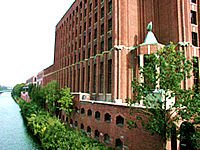
Ullsteins printing house
|
Still Berthold couldn’t supply brass blanks, and the masses of paper between the letters were explosive in power: the base line often flew off somewhere.
So typographic design was a rare thing at the time. Architecture on the surface, it wasn’t even a stucco border on the ceiling. Creeping slowly along its way – the time was ripe for some new point of view.
Then, suddenly, we heard about a certain Lange who came from Professor Tiemann in Leipzig. He had supposedly made such a name for himself there by painting Cyrillic signs for the occupying power that he preferred to come to Berthold in the Mehringdamm, lower Kreuzberg, where Turks live nowadays and where the nights are meant to be long. There he had founded a typographic study group as a cell of the Berlin Typographic Society. We went there, to see if it was worthwhile. This Lange guy, not even thirty years of age, was an event!
He extinguished our small-minded typographic knowledge in two or three evenings. He showed us typography that we had never heard of. He told us about Jan (Tschichold) formerly Iwan, about Imre Reiner, the painter-calligrapher, and the Swiss typographers. He encouraged us to play with scissors and colored papers, with layout and type matter, to try things we had never learned and to forget the old rules. |
 |
|
He was the first one in Berlin who overcame the ‘thousand-year’ break in typography and showed the typographers how to follow the Bauhaus movement. His type samples in the Berthold ads were of a certain style, but even more: juice and force! The pettiness of post-war typography was gone.
Günter Gerhard Lange was also the first one who brought a breath of fresh air into the greybearded association that was the Berlin Typographic Society at that time. A long time before Peter Handke’s play ‘Offending the Audience’, he provoked people with his design lectures, forced opposition, challenged, prevented the participants from dropping off with the slide lecture. At that time Lange made typography an event, like 50 years later a rare good ‘Tatort’ episode on TV would. (reference to ‘Scene of the Crime’, a TV detective show).
Meanwhile, thanks heaven, he has not changed. In Germany he is still the clarion warning voice for good typography. By the way, we were poor. Poorer than our children want to believe today. A top-level assistant earned 1,50 DM gross per hour. Nevertheless, for the event that was Lange, we would gladly have paid the premium of apprenticeship. However, Lange taught without asking a cent.

He showed the public, mainly photo typesetters, the long march of the typographers through the centuries. From the calligraphers through the first real typographer (Gutenberg) up to the international typo-scene of our days. He demonstrated how the photo-composition-revolution here in Germany had spoiled the feeling for good typesetting and correct type design. Because every typesetter must learn first of all to control the new systems. He showed that there is not enough care for the next generation, and how to improve that without relying just on the academies.
 |
The studios and the photocompositors have to train the new generation – in intuitive feeling, and not just in operating mechanics. As well as a certain Günter Gerhard Lange had already done 29 years before in Berlin. The lecture ended in public provocation, as usual with GGL – friendly tone, but hard words. |
|
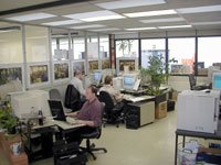
Photo-composition
|
Billy Graham has been called the machine gun of God. When he preaches, nobody falls asleep. Günter Gerhard Lange is Gutenberg’s machine gun. In our typographic misery, it would be enough if every young photo typesetter would participate in a few Lange lectures. If typography really matters to us, we need him for such lectures. He can help us to reach the same typographic level as Americans, French and British. In 1951 he started rousing us. Today, 30 years later, he doesn’t look one bit older. And the new blood won’t fall asleep with him, but listen wide-awake.
“Solemnity is based on GGL’s Solemnis which has never been digitized.”
Since 2000 he works again there. GGL created the following typefaces:
AG Book, Arena, Bodoni Old Face, Boulevard, Caslon Book, Champion, Concorde, Derby, El Greco, Franklin Antiqua, Imago, Regina, Solemnis.