 |
| |
 Which tools are your preferred ones to create fonts? And are you doing drawings yourself? Which tools are your preferred ones to create fonts? And are you doing drawings yourself? |
| |
| I begin in Paint Shop Pro. Some of my fonts are hand drawn or mouse-drawn, and some are done from clip art, which I will usually modify to my preference. After I render the initial image in PSP, I take it into Fontographer and finish it up in there. I've also dabbled in FontLab, and TypeTool, but all of my fonts to date have been generated in Fontographer. |
| |
| There are certain stations in a font designer's life - it starts with pure fun and an enormous output, followed by a phase of learning more about font-making and increasing quality standards and the desire to express something specific. How is your experience with it? |
| |
| That has been exactly my experience
I have truly been having the time of my life designing these fonts, and in the short time I've been doing it, have produced nearly 40 of them. However, my hunger for more knowledge and the desire to begin designing actual type, or text, has given me the incentive to learn all I can about the different font-making programs and font-making in general. |
| |
| You are specialized in doing Letterbats and Dingbats. Do you plan to make text-fonts as well? Or more Dingbats? You know we can never get enough of them ;-) |
| |
| That is my ultimate goal, to make text fonts, and I am slowly learning what I need to know in order to do so; however, because of my love of graphics, my first love will always be in making Letterbats and Dingbats, and I will never stop making them. I have several Dingbats in the works now, and ideas for lots more. |
| |
|
|
 Cloister Initials Cloister Initials
|
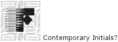
| Thoughts about Letterbats - sometimes it seems we are missing the culture of ornamental initials as they were used in Baroque and Victorian times (and before, of course). That might be a reason why we enjoy the pictured letters. Any idea how to cultivate the heritage of ornamented initials today? I have a foggy concept that they should have less scrolls and flowers, but contemporary symbols instead and a touch of abstraction. Maybe you have some ideas on this? |
| |
| Although I believe traditional styles will always be popular (as well they should), I also believe that the "ornaments" or pictures of an ornamented initial should be kept to a minimum. Some of the ones I've seen with lots of flowers and scrolls seem to be a bit overwhelming and difficult to view, and can actually take away from the charm of both the picture and the letter. I am a lover of the Victorian era, however, so I believe that some of the styles of the past should be kept intact, but with a bit less ornamentation. |
| |