|
|
|| Blackletter Index || back to Themes ||
|
|
 |
||
|
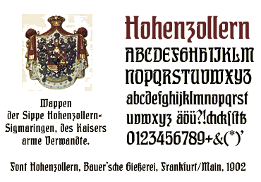
Hohenzollern belongs to the group of German hybrid typefaces that were produced between 1900-1914. There are two main categories: those that mixed roman and gothic forms through the idiom of Jugendstil, and those that moderated both roman and blackletter traditions in the service of usable text types without imposing stylistic characteristics. (Christopher Burke on German Hybrid Typefaces 1900-1914, this essay was published in the book Blackletter: Type and National Identity). Hohenzollern was designed by Carl Albert Fahrenwaldt (1864-1941). He also made a fat version of this typeface which was called Imperial (PDF-sample available, size: 1,5 MB). |
||
|
|
|| Blackletter Index || back to Themes ||
|
|